
Start with a baseline, or you cannot claim a result
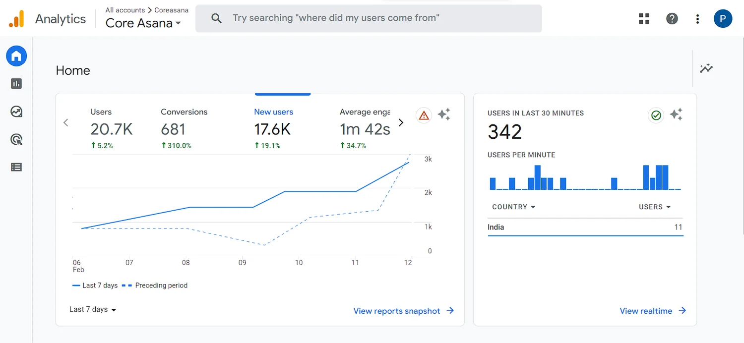
Before touching anything, write down what is true today. On the store in this case study that was: 21,000 sessions a month, 0.39% conversion, 64% bounce, 37-second average visit, $24 ticket, $9 customer acquisition cost.
That last pair is the real problem statement. Spending $9 to acquire a customer worth $24 at a 0.39% conversion rate is a business buying traffic it cannot convert. Writing the baseline down is also what makes the eventual result arguable rather than a feeling.
Audit the funnel against something other than taste
We scored every step of the purchase funnel against standard usability heuristics. Scoring matters because it ranks problems by severity instead of by who raised them loudest, and it gives a stakeholder a reason to accept a change they do not personally like.
The product detail page scored worst. It was creating friction at exactly the point where it needed to create confidence — twelve SKUs competing for attention on a store with one genuinely strong product.
Write the hypothesis down before you change anything
This is the step most teams skip, and it is the one that separates a redesign from an experiment. Ours was six lines:
- Move the pain points high on the page, where they create the need
- Say one clear thing instead of five hedged ones
- Offer a freebie to convert casual browsers
- Put expert and customer testimonials in front of the buy decision
- Focus the entire page on the primary product
- Use video infographics to show the product in use
Alongside those: irrelevant SKUs moved out of the main path, USPs raised to cut through competing listings, and the purchase funnel reduced from five steps to three.
Test it rather than shipping it on faith
A 50/50 A/B test on desktop against the existing site, 21,000 sessions in the experiment, measuring conversion rate, average visit duration and bounce rate, with section-level engagement as the secondary read.
| Metric | Before | After |
|---|---|---|
| Conversion rate | 0.39% | 1.3% |
| Bounce rate | 64% | 48% |
| Average visit duration | 37 seconds | 1 min 42 sec |
| Ticket price | $24 | $35 |
The price rise is the part worth noticing. Once the page justified the product, it carried a 46% higher ticket without surrendering the conversion gain. Conversion work is usually framed as making more people buy; often it is making the right people willing to pay more.
What to do this week
- Pull your baseline numbers and write them somewhere permanent
- Walk your own funnel on a phone, on mobile data, as a first-time visitor
- Count how many products compete for attention on your best-selling page
- Write one hypothesis with a number attached, then test it
Comments
Comments are not wired up yet. In the meantime, the conversation happens on LinkedIn — or write to hello@tagthose.in and we will reply.