
Healthcare Appointment widget
An appointment widget doctors would actually keep on the site
Doctors lose hours of every day to booking admin. We designed a scheduling widget light enough to drop onto any practice site and clear enough that patients complete it.
- Client
- Healthcare practices
- Sector
- Healthcare
- Scope
- Research, UX, interface design
- Surface
- Embeddable web widget
The challenge
Doctors lose a meaningful part of every working day to scheduling, rescheduling and chasing appointments — time that is not clinical, not billable and not enjoyable.
Accessibility was the binding constraint. If the widget is hard to place, hard to style or hard to complete on a phone, it does not get adopted however good the flow is.
What we did
Five stages — empathise, define, ideate, prototype, test — with qualitative research run with practising doctors rather than assumptions about them.
Findings became two prioritised feature lists, so build order reflected impact. On a widget that has to stay light, the list of what you are not building matters as much as the list of what you are.
The design thinking process followed
Followed properly, because the whole risk on a product like this is designing for an imagined doctor rather than a real one.
Empathise
Qualitative research with practising doctors.
Define
The challenges that are genuinely daily, not occasional.
Ideate
Screen-level and patient-card features, ranked.
Prototype
Three wireframe passes toward the smallest viable widget.
Test
Checked back against the doctors who set the brief.
Asked the people doing the job
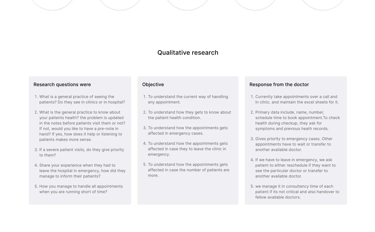
Research questions, objectives and what doctors actually said — including where patients give up, which challenges are genuinely daily, and which features merely sound useful.
A persona built from interviews
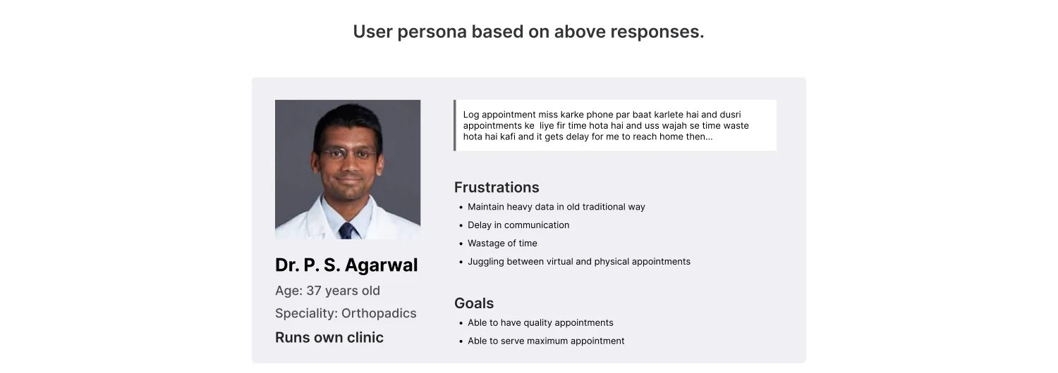
Not from a template. Running his own clinic, twenty-plus years in, and specific about what an extra system would have to earn.
Ranked, then cut
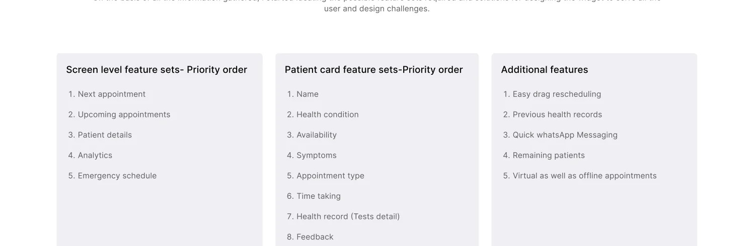
Screen-level and patient-card features prioritised separately, so the first release carried the things that remove work rather than the things that demo well.
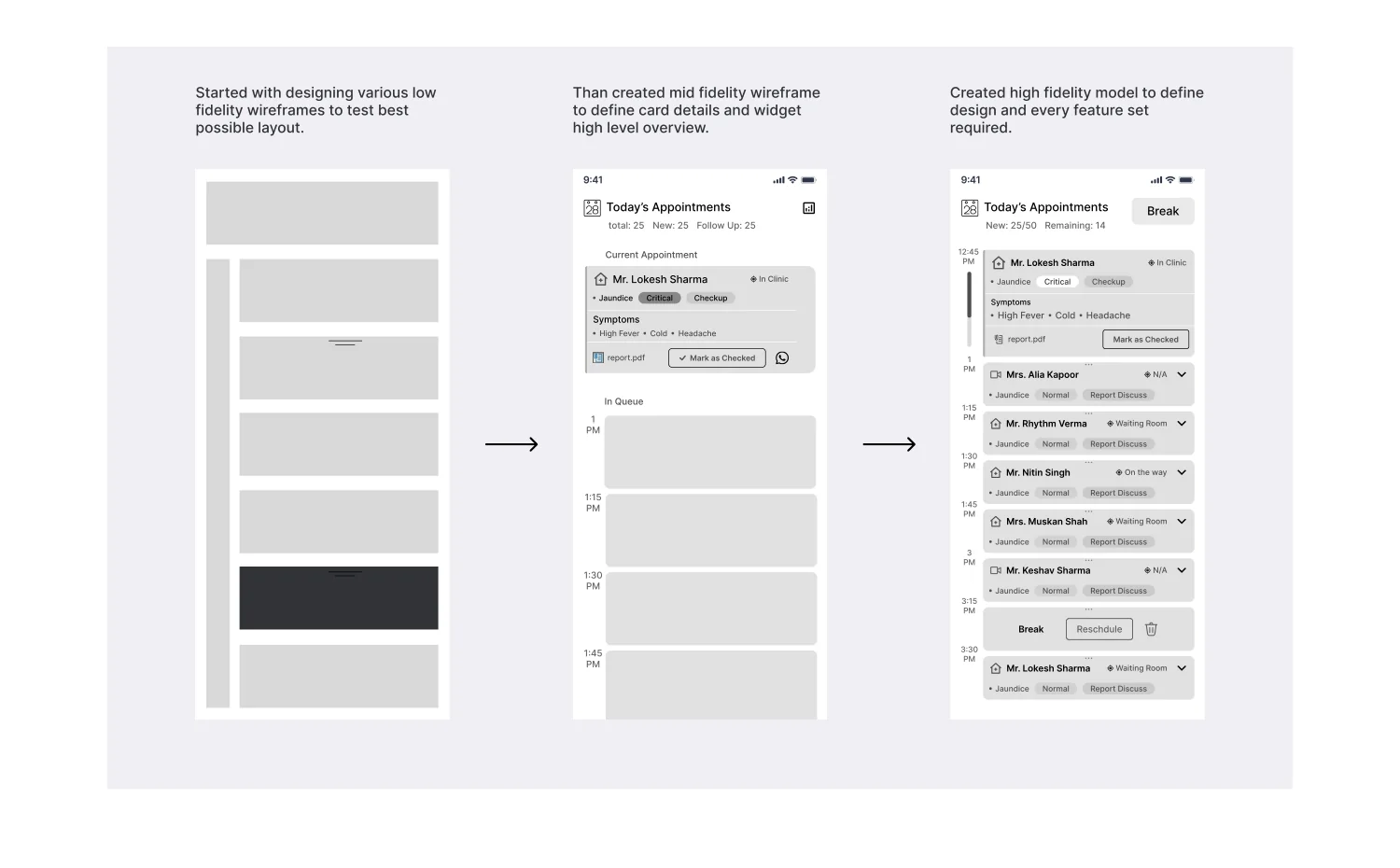
Three passes in grey
Each one narrowing towards the smallest thing that could still carry a full booking — because every element added to an embeddable widget is one more thing that can clash with the site hosting it.
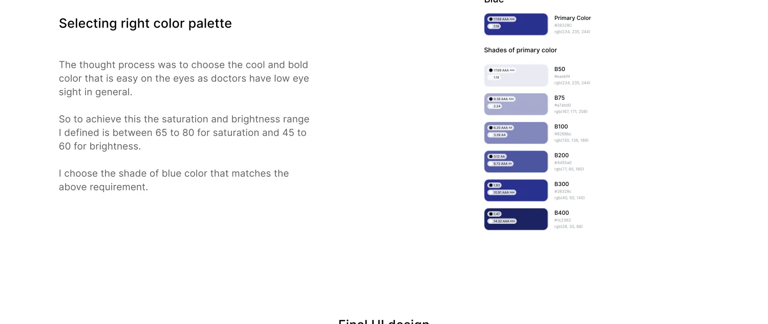
Blue, and the reason why
The colour healthcare already uses, and one that is easy on the eyes for doctors working long screen hours. We fixed the shade by saturation and brightness range — 40 to 80 on both — and picked within it rather than by eye.
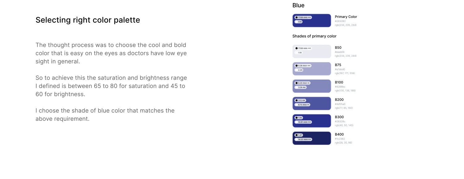
Primary, and its shades
One primary with a documented ramp, so every state in the widget — hover, active, disabled, selected — comes from the same decision rather than a new one.
Calendar, slots and state in one surface
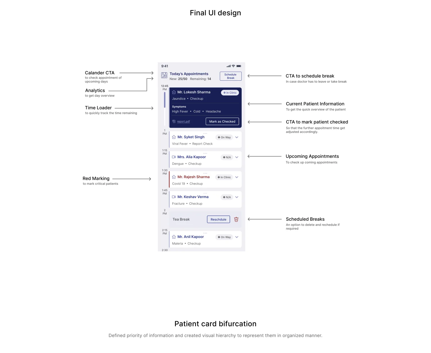
Compact enough to drop onto any practice site, complete enough to finish a booking without leaving it.
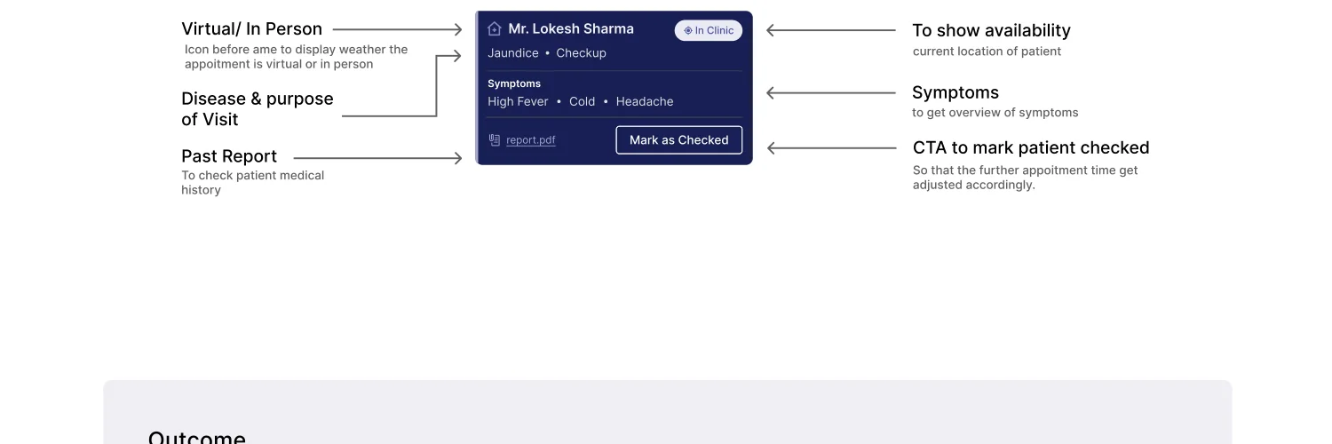
The patient card, split by visit type
In-person and virtual need different information in front of the doctor at the moment they open it, so the card bifurcates rather than showing everything to everyone.
Conclusion
An appointment widget light enough to embed on any practice site and clear enough that patients finish it — with the feature set decided by practising doctors rather than by us.
The restraint is the design. Every element we left out is one less thing to clash with the site it lands on, and the reason it gets adopted at all.
What it added up to.
Got something that needs building properly?
Fifteen minutes is usually enough for us to tell you something useful about it.