
Telecom · CPaaS CEQUENS
A cloud communications console, designed from zero
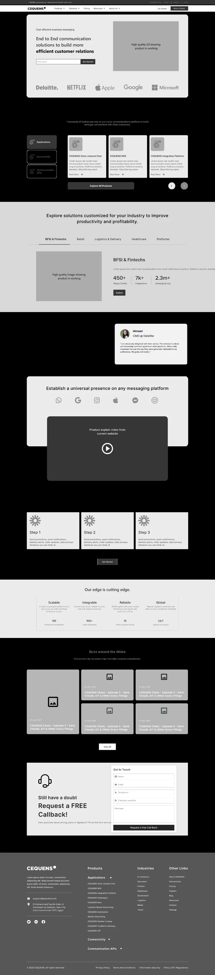
CEQUENS sells messaging, voice and automation APIs to businesses across the Middle East and Africa. The product was strong; the surface in front of it was not telling that story. We rebuilt the marketing site and the platform interface on one system.
- Client
- CEQUENS
- Sector
- Cloud communications
- Scope
- Research, IA, design system, UI
- Surface
- Web app & marketing site
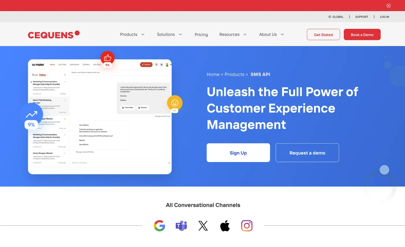
The challenge
CEQUENS had grown by adding products. Each one arrived with its own page, its own vocabulary and its own idea of what a button looked like. A visitor could not tell in ten seconds what the company sold, and a customer crossing from messaging into voice had to relearn the interface.
The brief was written as a redesign. The layout was the symptom; the information architecture was the cause.
What we did
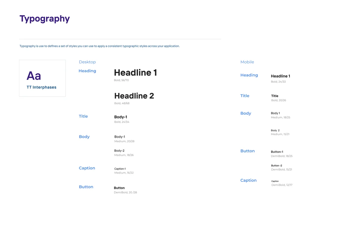
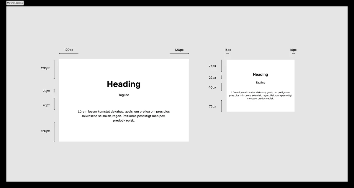
We rebuilt the structure first — a site map, then a component inventory, then a documented type and spacing scale — and only then drew screens.
Six success measures were agreed before design began: time on page, bounce rate, pageviews, conversion rate, referral sources, and qualitative feedback. Review meetings stopped being about preference and started being about which measure a screen moved.
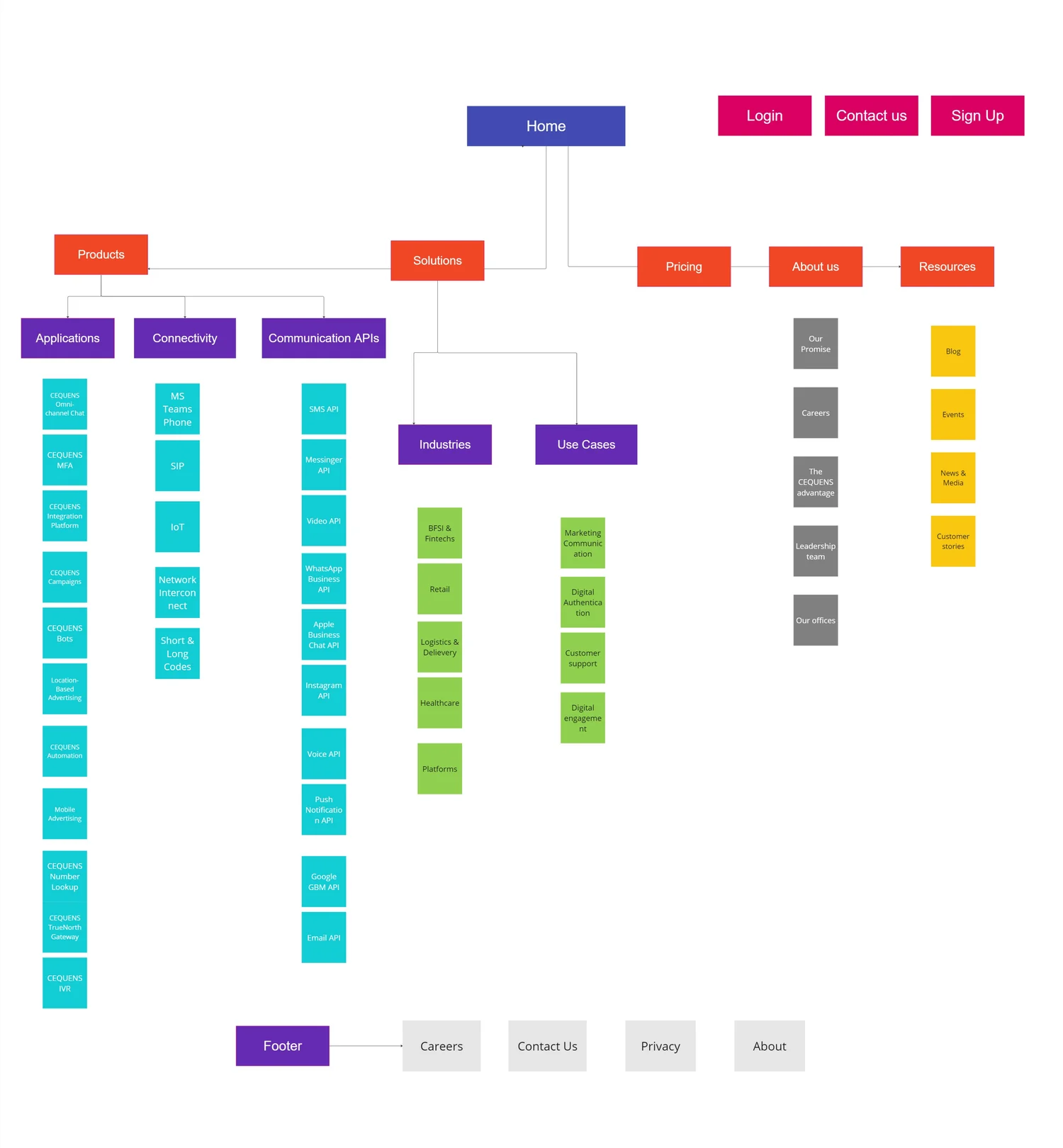
Site structure, before anything else
Products, solutions, industries, developer resources, partners and careers separated into branches with predictable shapes — so a seventh product could be added later without triggering another rebuild. Mapping it exposed the real problem early: several products were competing to be the same page.
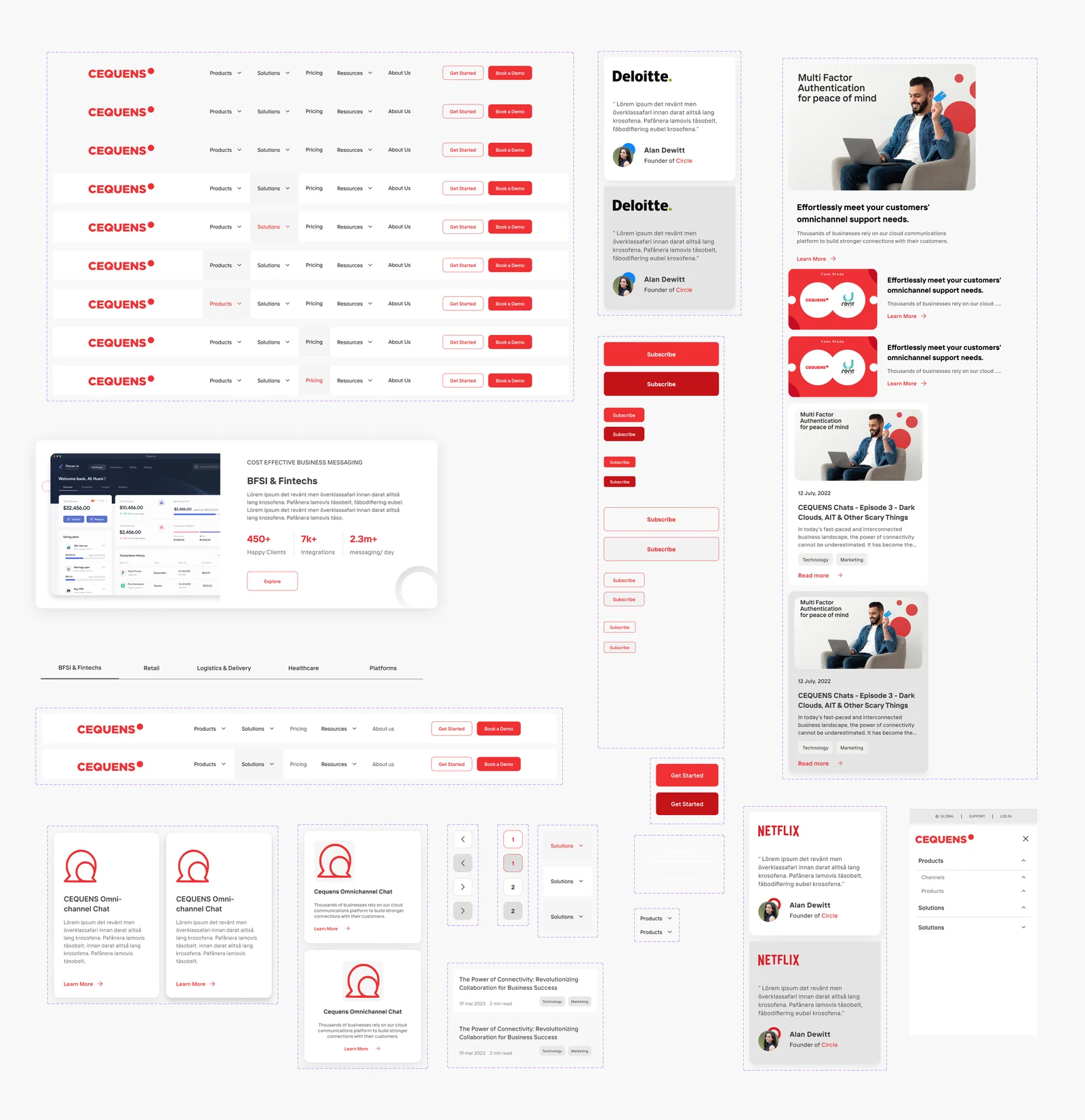
One board, every component
The whole surface laid out in a single view. Doing it this way is what stops a system drifting — you can see immediately that four pages have invented four versions of the same card, and settle it once.
The product template
Product pages lead with the outcome and put the technical proof underneath, because two audiences — the buyer and the engineer who has to approve it — land on the same URL wanting different things from it.
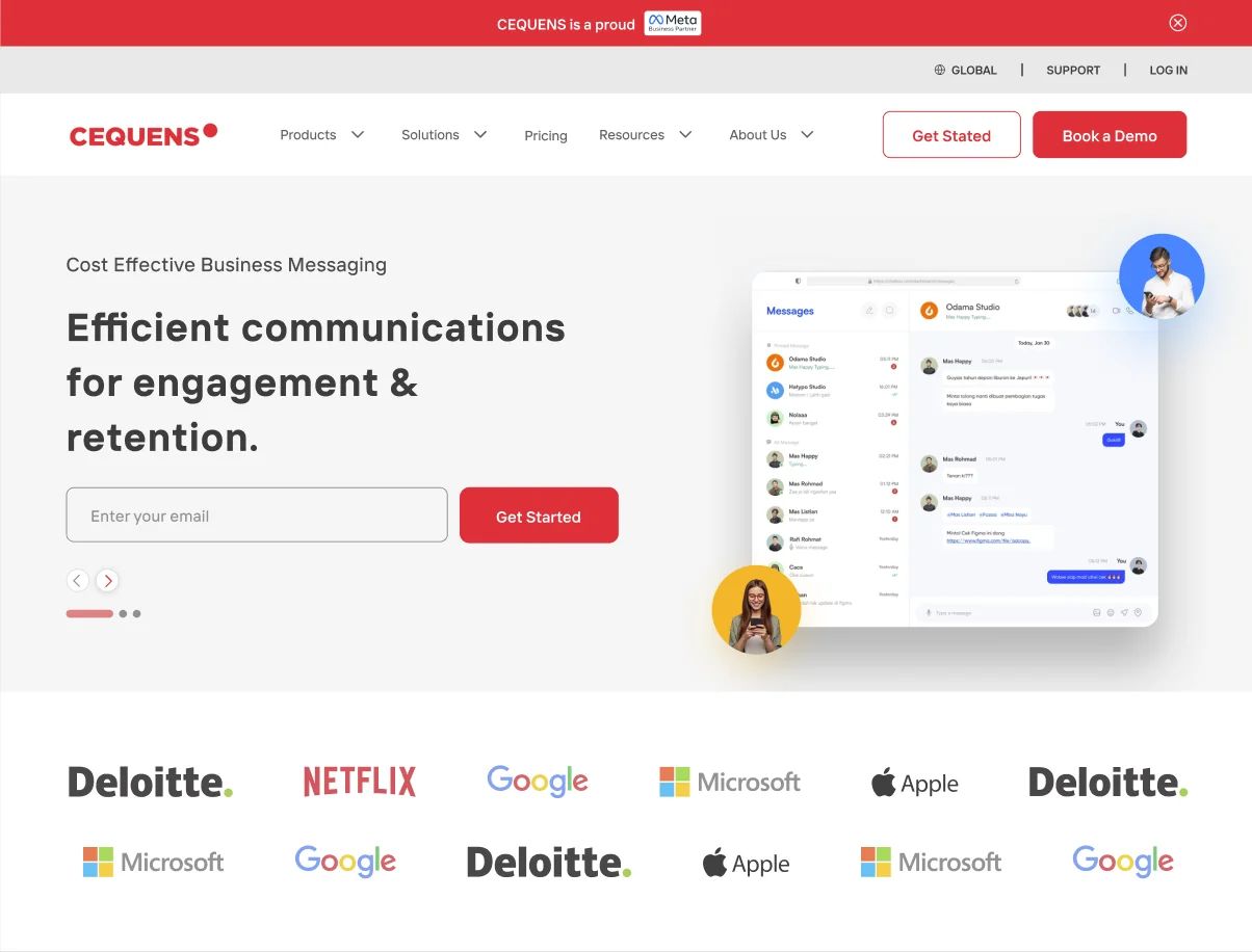
Products, on one pattern
Every product page is the same template with different content, so the marketing team can publish a new one without a designer in the loop.
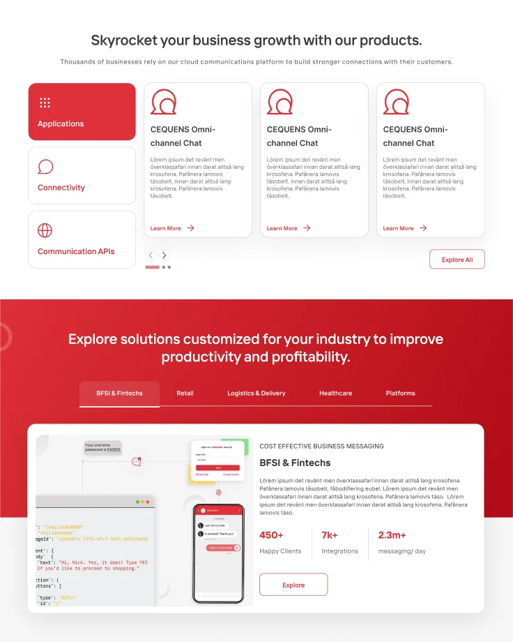
Sold by industry, not by feature
BFSI, logistics, healthcare and platforms each get their own entry point, because a bank and a courier company are not buying the same thing even when they end up using the same API.
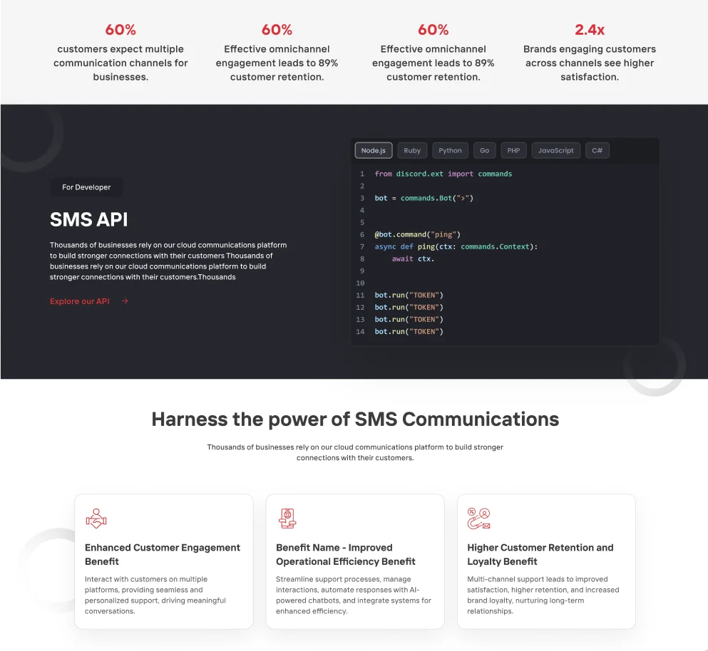
A page for the person who integrates it
Code in front, prose behind it. The developer evaluating the API has a different question from the director who signed the contract, and answering both on one page means ordering it for the one who leaves fastest.
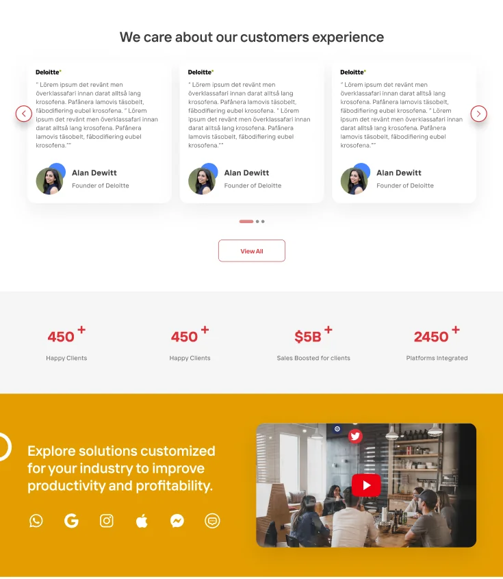
Proof, placed where the doubt is
Testimonials and platform figures sit directly before the decision rather than collected on a page nobody visits.
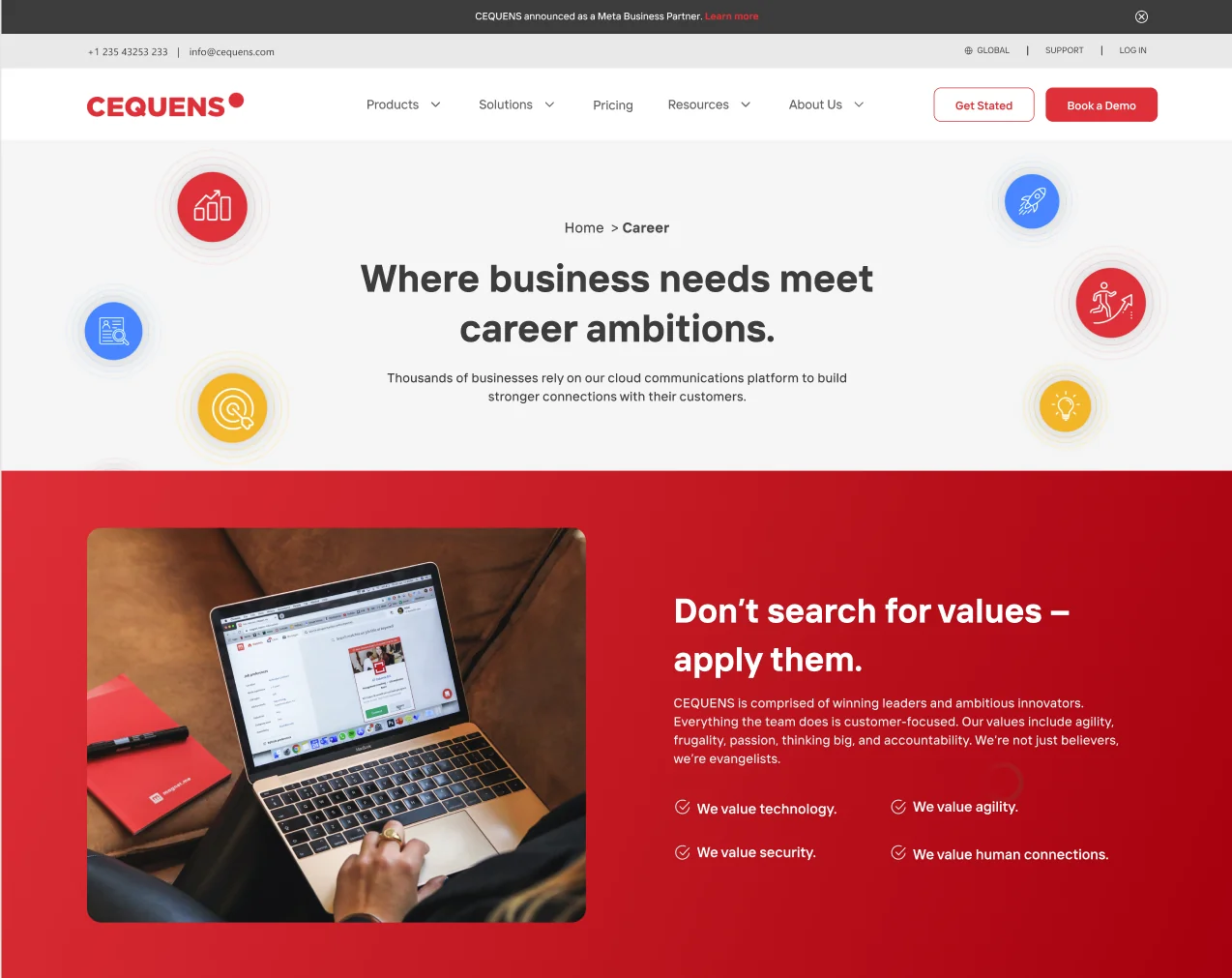
Careers, on the same system
A different job for the same components. Hiring is a conversion funnel too, and it deserved the template rather than a bare job list.
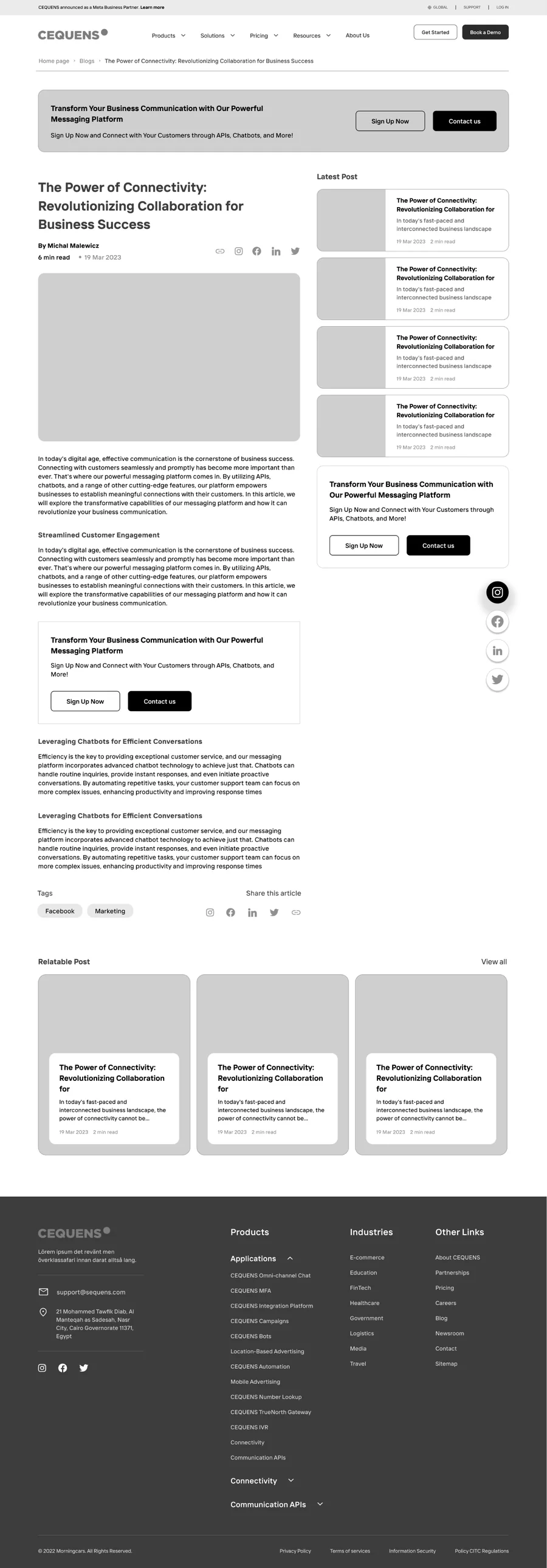
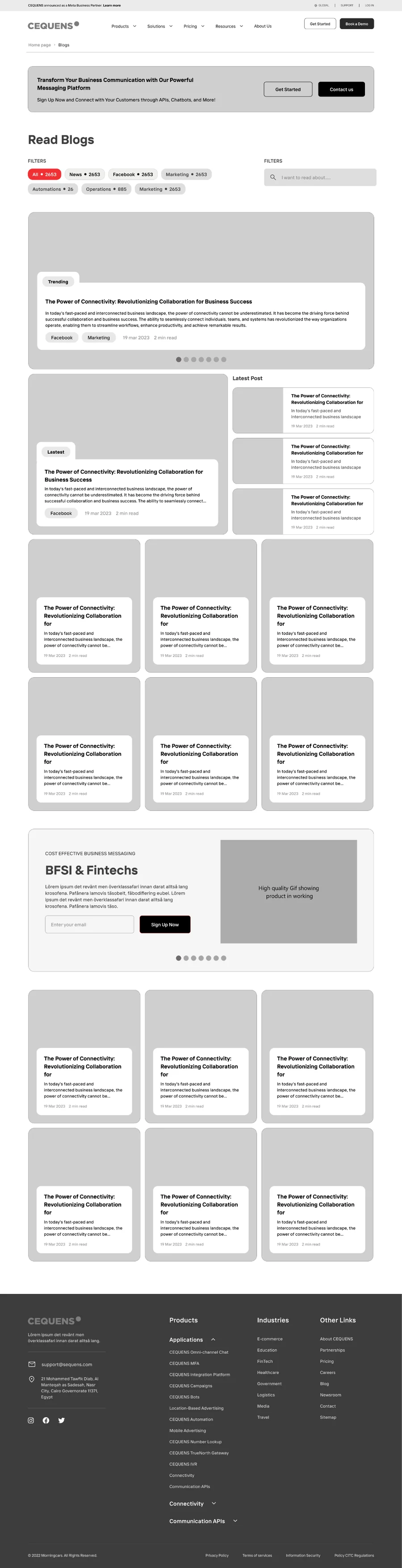
The whole thing on a phone
Mobile was designed as its own set of screens rather than a narrowed desktop. On a site where most traffic arrives on a phone, adapting after the fact is how you end up with a homepage that works and a product page that does not.
Conclusion
CEQUENS now has one system behind both the marketing site and the platform console: a type scale, a spacing scale, a component library and seven page templates covering desktop and mobile.
The interface finally carries the proposition the sales team had been making verbally for years — enterprise-grade infrastructure that an ordinary business can operate — and the team can extend it without us.
What it added up to.
Got something that needs building properly?
Fifteen minutes is usually enough for us to tell you something useful about it.