
D2C · Commerce Corasna
A storefront rebuilt around where buyers were dropping off
Corasna was the first brand to bring acupressure mats to the Indian market. Traffic was healthy and almost nobody was buying. We rebuilt the funnel around the evidence and tested the result against the original.
- Client
- Corasna
- Sector
- D2C wellness e-commerce
- Scope
- CRO, research, storefront UX
- Timeline
- 120 days
The challenge
Twenty-one thousand visitors a month were arriving and 0.39% of them were buying. Bounce sat at 64%, the average visit lasted 37 seconds, and customer acquisition cost was $9 against a $24 ticket.
The business was buying traffic it could not convert, and the product detail page was where it fell apart. People arrived with intent, found nothing that justified the price or the brand, and left.
What we did
A heuristic audit of the whole funnel, a written hypothesis, and then an A/B test against the existing site rather than a redesign shipped on faith.
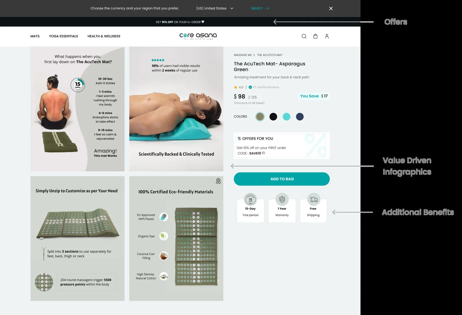
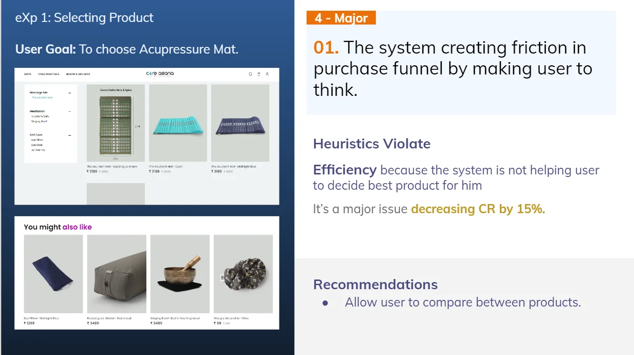
Twelve SKUs were competing for attention on a store with one genuinely strong product. We focused the page on the hero product, moved the pain points to where they create need, and cut the purchase funnel from five steps to three.
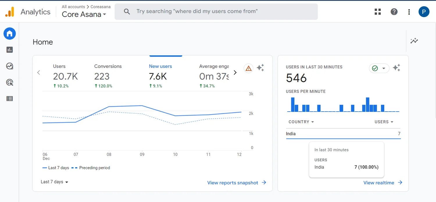
What the numbers said at the start
21k sessions a month converting at 0.39%, with a 64% bounce rate and a 37-second average visit. Agreeing the baseline first is what made the result arguable later.
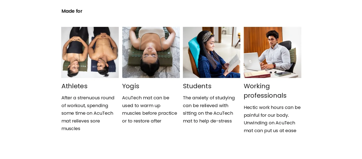
The buyer was not who the site addressed
The market was health-conscious adults looking for an alternative route to pain relief — athletes, yoga practitioners, students, desk workers. People who needed convincing the thing worked, not telling that it existed.
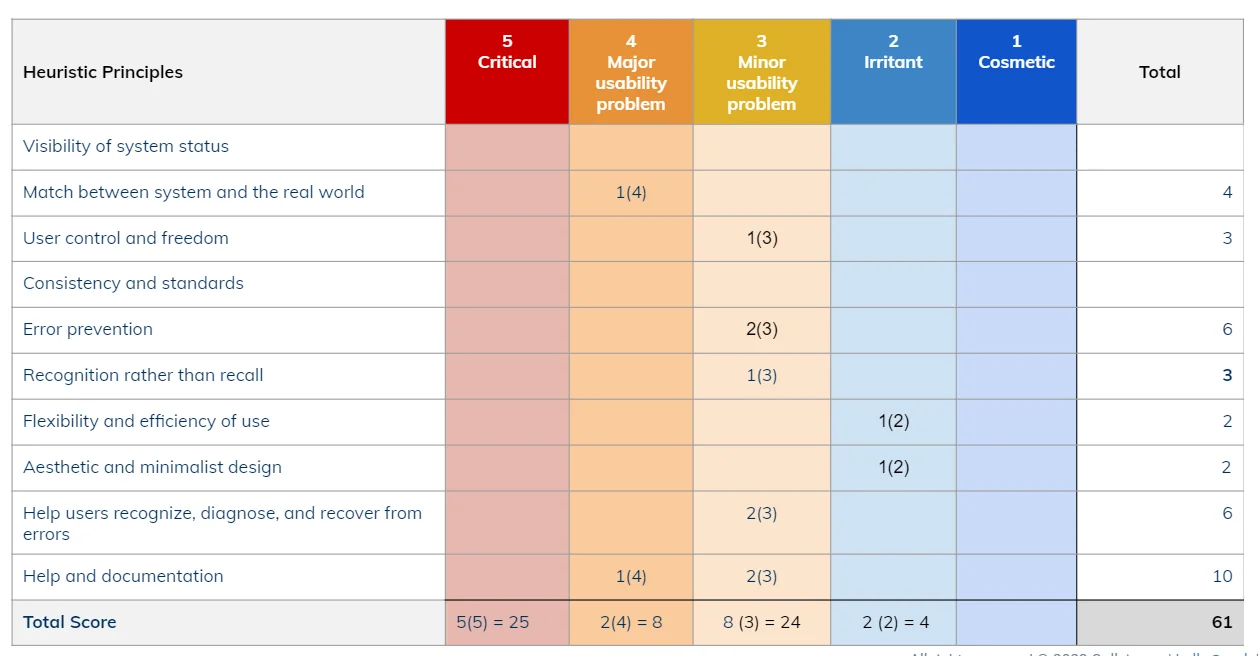
Scored, not argued about
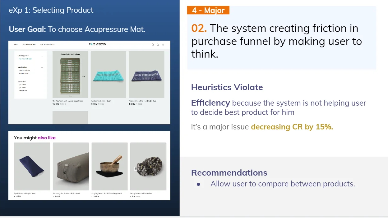
Every funnel step rated against standard usability principles, so problems could be ranked by severity rather than by who raised them loudest.
The hypothesis, written down first
So that a test could prove us wrong rather than confirm us right:
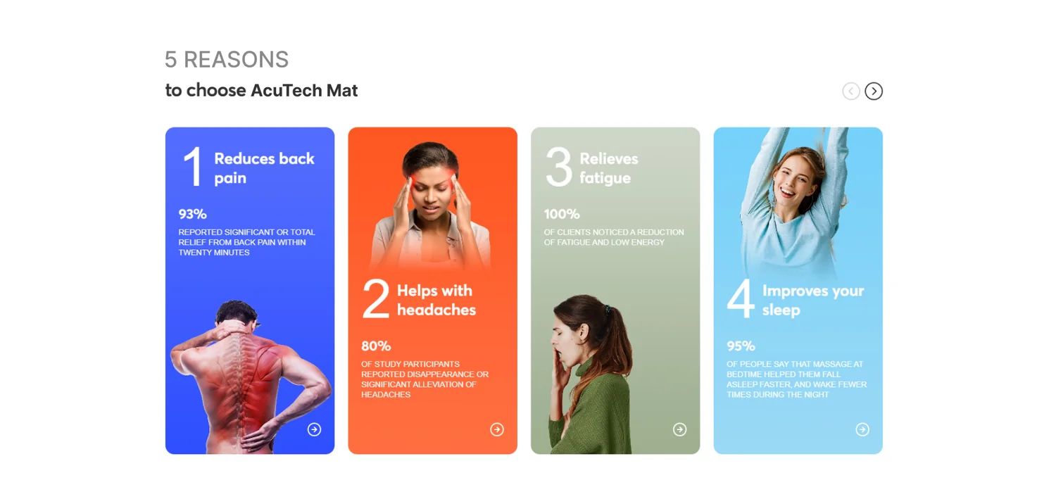
- Move the pain points high on the page, where they create the need
- Say one clear thing instead of five hedged ones
- Offer a freebie to convert casual browsers
- Put expert and customer testimonials in front of the buy decision
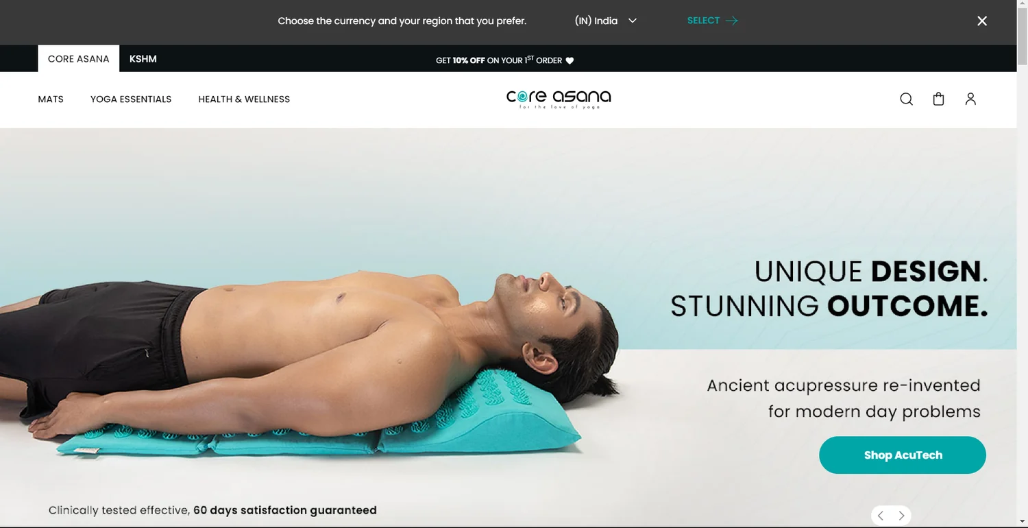
- Focus the entire page on the primary product
- Use video infographics to show the thing in use
Alongside those: irrelevant SKUs moved well out of the path, USPs raised to cut through competing listings, and the funnel reduced from five steps to three.
Reasons, before the price
The case for the product placed ahead of the buy decision instead of below it, which is where it had been doing nobody any good.
The variation won
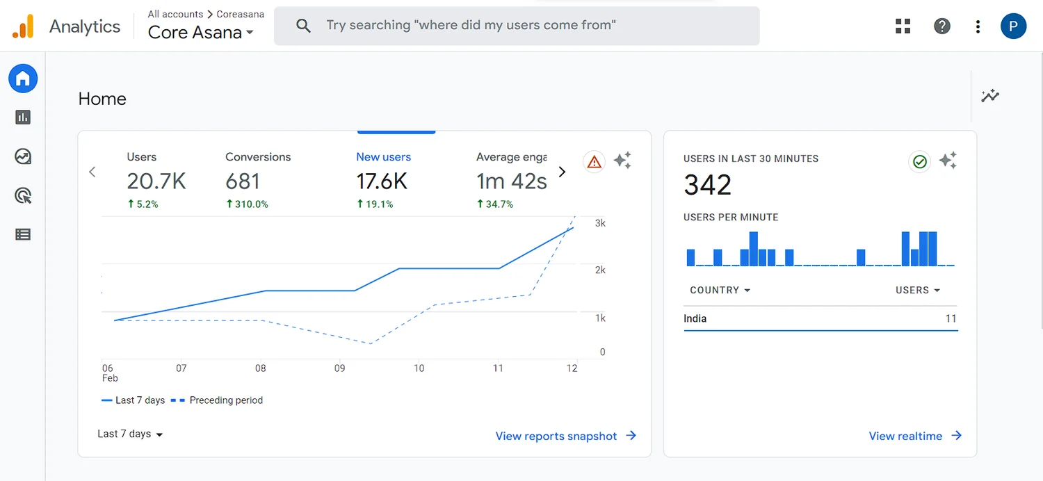
A 50/50 desktop A/B test over 21,000 sessions. Conversion went from 0.39% to 1.3%. Bounce fell to 48%. Average visit duration went from 37 seconds to 1 minute 42 — and the hero SKU carried a price rise from $24 to $35 without losing the gain.
Conclusion
Four times the conversion rate in 120 days, proven against the original rather than asserted. The page that had been losing money is now the one carrying a higher price.
The method mattered more than any single change: baseline first, hypothesis written down, one variable set, and a test big enough to believe.
What it added up to.

Got something that needs building properly?
Fifteen minutes is usually enough for us to tell you something useful about it.