
Fintech Paytm
A super-app interface study
A self-directed teardown and redesign of a consumer fintech super-app — the category where feature count and usability pull hardest against each other.
- Client
- Self-initiated study
- Sector
- Fintech
- Scope
- UX audit, interface design, style guide
- Surface
- Mobile app
The challenge
Super-apps are the hardest consumer interface problem going. Recharges, bill payments, travel booking, a savings account, investments, insurance and a merchant business all sit behind one icon, and every team inside the company has a legitimate claim on the home screen.
This is a self-initiated study — nothing here was commissioned. We took it on because a structure that survives this much functionality will survive most client products.
What we did
A current-state audit first, documenting where the existing experience was cluttered or inconsistent, before any redesign started.
Then the service catalogue mapped into consumer-primary and business-secondary tiers, the ten most-used features ranked, and the home screen designed around those rather than around the organisation chart.
Everything behind one icon
The service catalogue split into two tiers, which is the only way a product this broad can be reasoned about at all.
Consumer — primary
Recharge and booking, financial services, and investment. Mobile and DTH recharge, bill payments, travel and movie bookings, a payments bank, a savings account, stocks and mutual funds, insurance and digital gold.
Business — secondary
Payment gateway, shop owner tools and advertising. Collection and settlement, business loans, invoicing and ledger, point-of-sale hardware, and promoted placement across the consumer app.
The goals we set
Usability
Easy to navigate, minimalist, with visual hierarchy maintained throughout. A refined user journey and a modern, vibrant display.
Priority
Focus on the most popular features, highlight the unique ones, and define a clear USP and value proposition rather than listing everything equally.
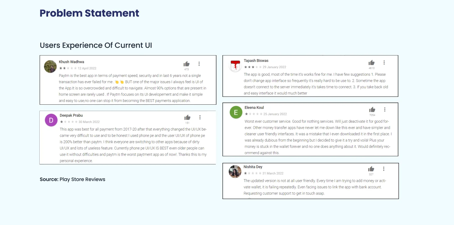
What users were already saying
Play Store reviews of the current interface, read rather than summarised. People will tell you exactly what is wrong with a product if you are willing to sit with the one-star reviews for an afternoon.
What the audit found
- Cluttered design
- Dull UI with no clear visual hierarchy to lean on.
- Hard to navigate
- No predictable path between the things people do most.
- Wrong things first
- Unnecessary and rarely used features displayed in first place.
- Features buried
- Difficult to find a particular feature once you need it.
- Inconsistent build
- Alignment, spacing and consistency issues throughout.
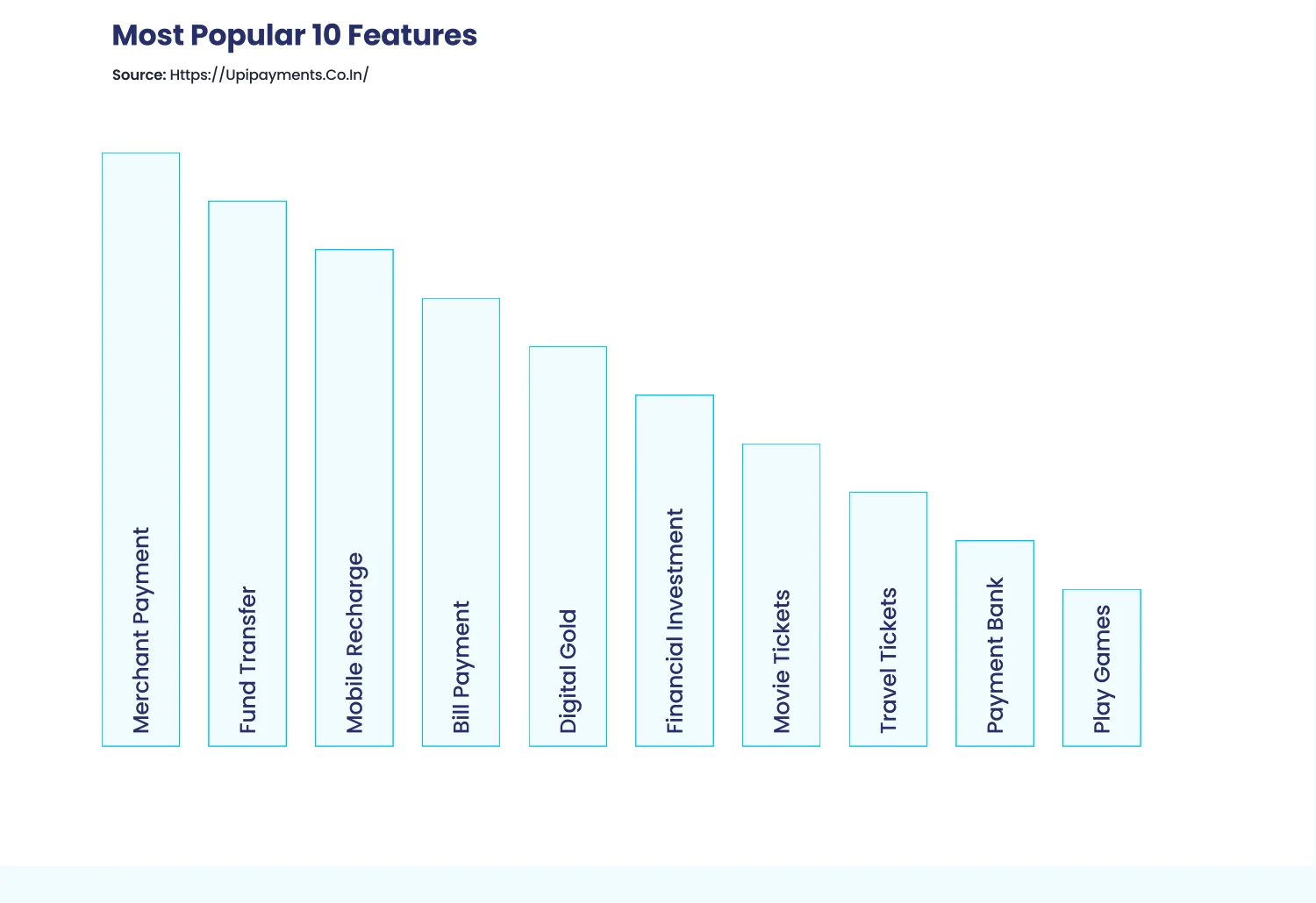
The ten most-used features
Ranked from public app data — merchant payment, fund transfer, mobile recharge, bill payment, digital gold, financial investment, movie tickets, travel, payment bank, play games. This chart is what settled the home screen argument.
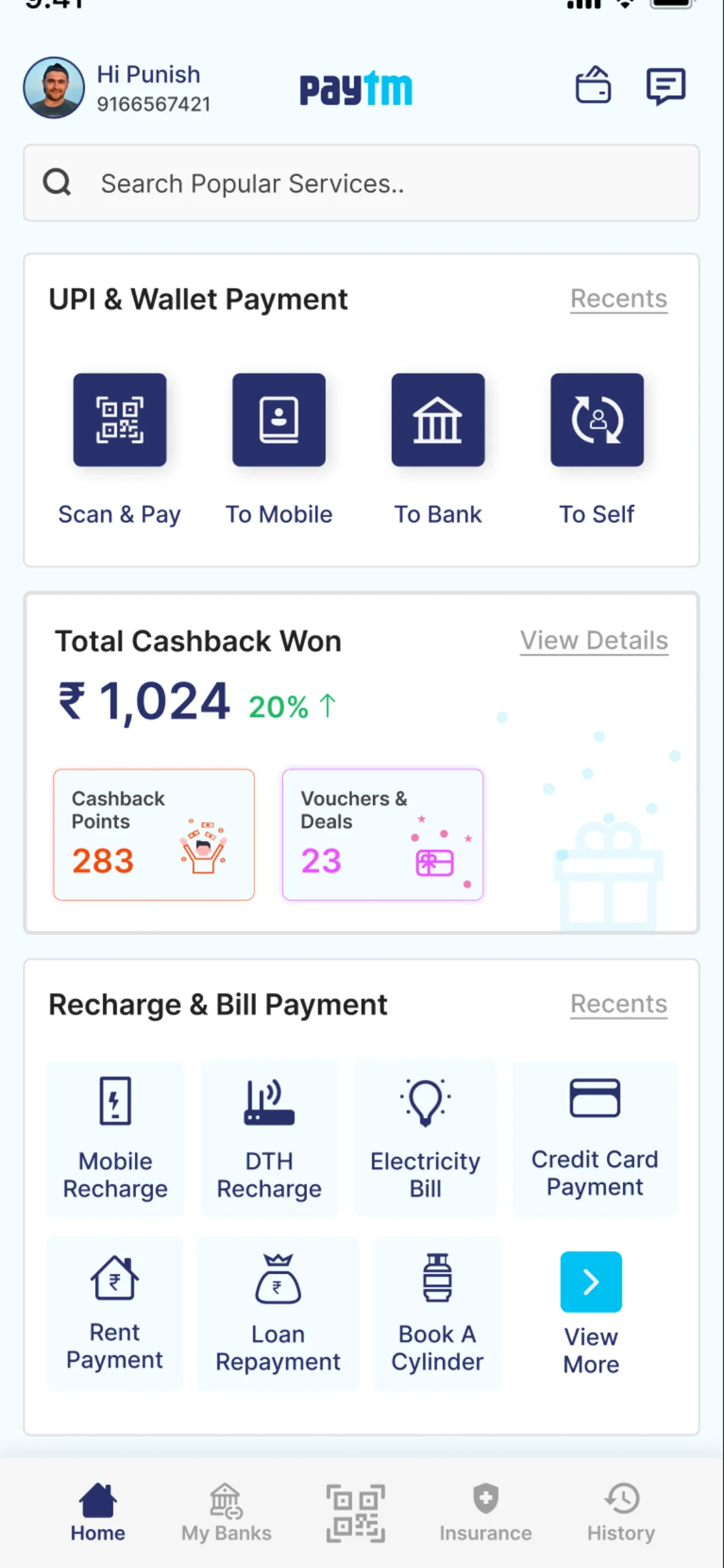
Organised by use, not by business unit
The home screen ranks what people actually open the app to do. Every internal team wants the top slot; the only defensible way to allocate it is usage.
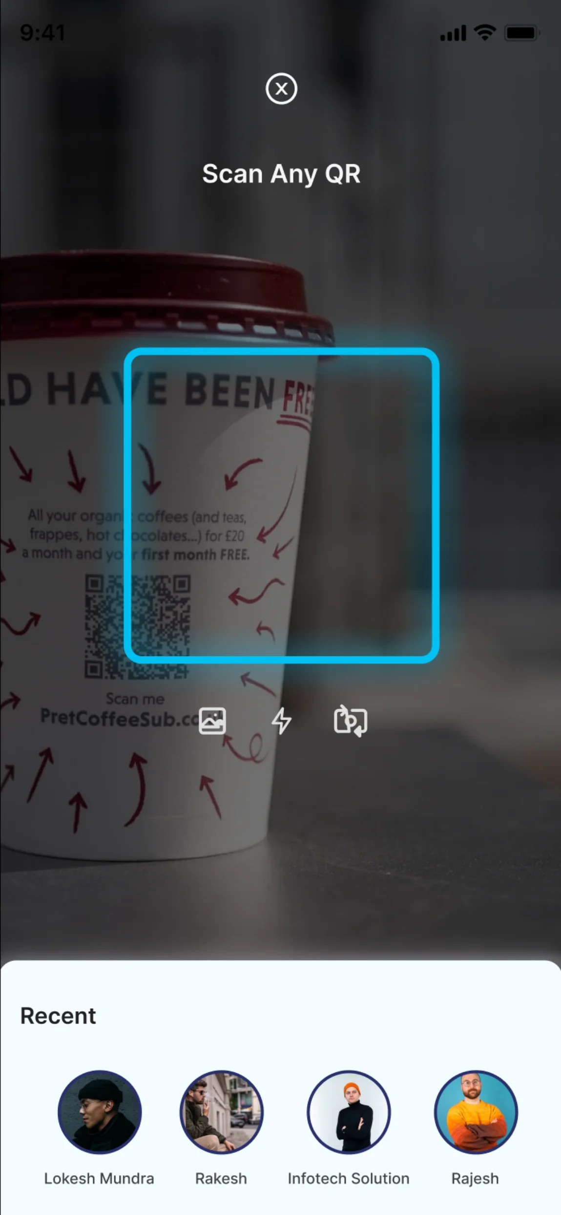
Scan and pay
The thing that competes with cash, and therefore the flow that has to be finishable in one screen without a moment's thought.
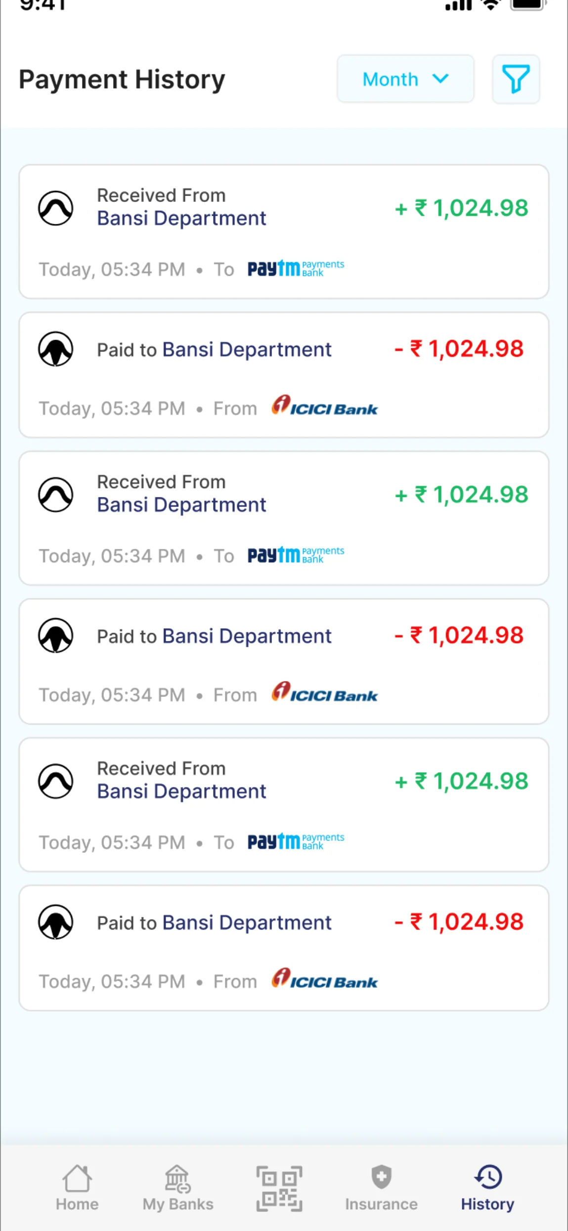
What happened to my money
Filterable history, because the second most common reason to open a payments app is checking something that already happened.
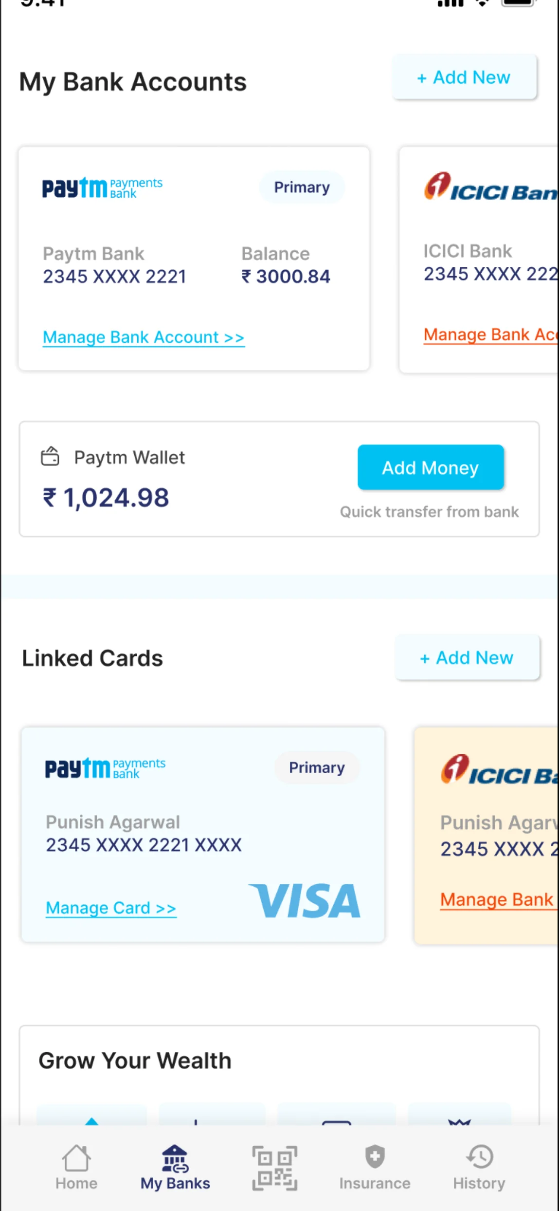
Accounts and cards, in one place
Balances and linked instruments surfaced together, so choosing what to pay with is not a separate expedition.
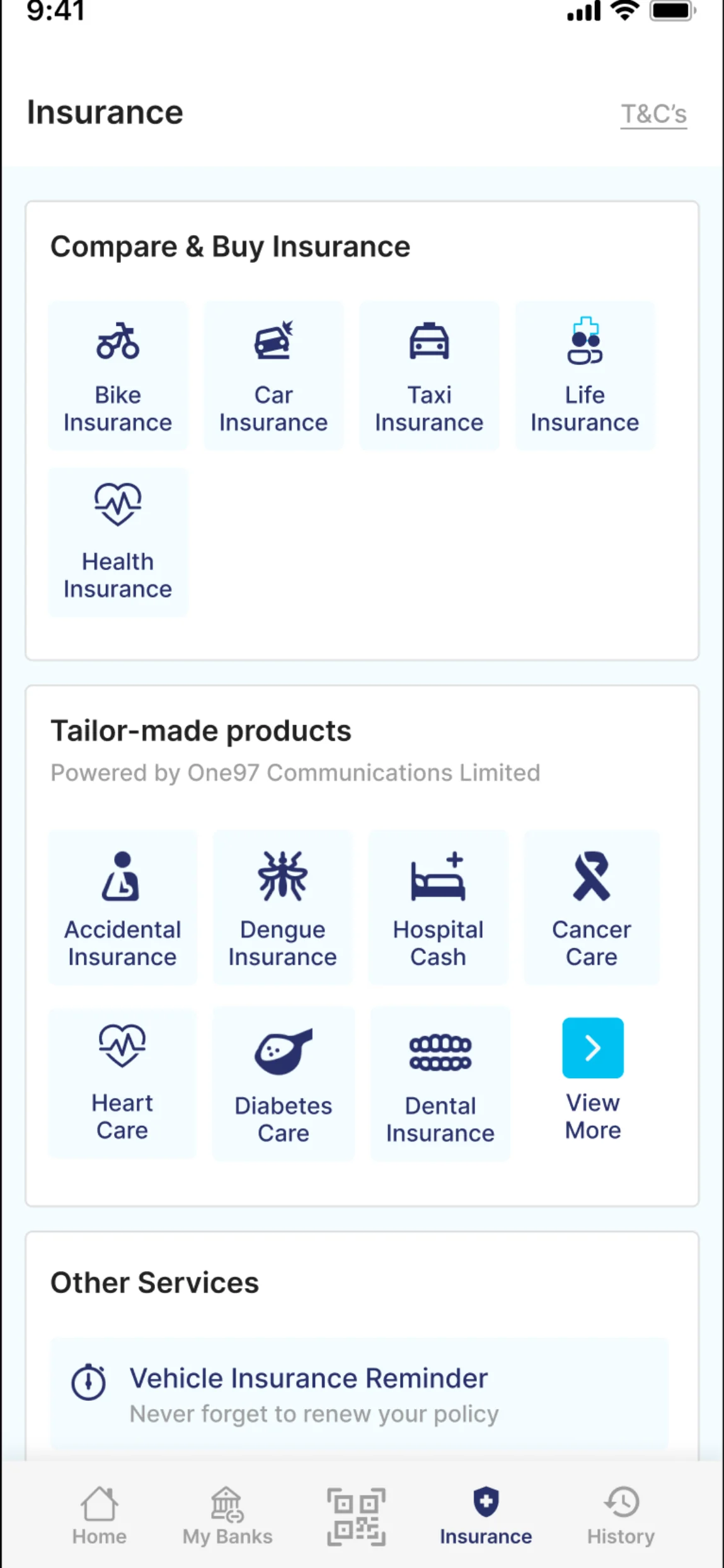
The long tail, grouped by need
Insurance, investments and bookings are where super-apps usually collapse into a wall of icons. Grouping by life situation rather than product category keeps the depth available without putting it in front of someone who only wanted to split a bill.
The colour system
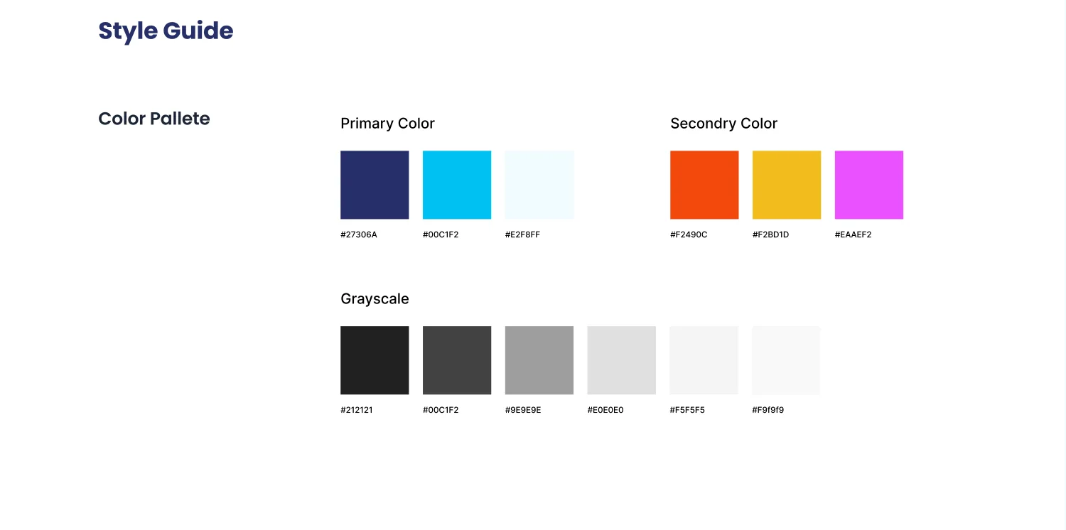
A three-step primary ramp carrying the brand, a secondary set for category coding across a very wide service catalogue, and a full greyscale for the interface underneath. On a product this dense, colour is navigation.

Type, at three weights
Regular, medium and bold — no more than that. A super-app has thousands of labels, and every extra weight is another decision a future designer has to get right.
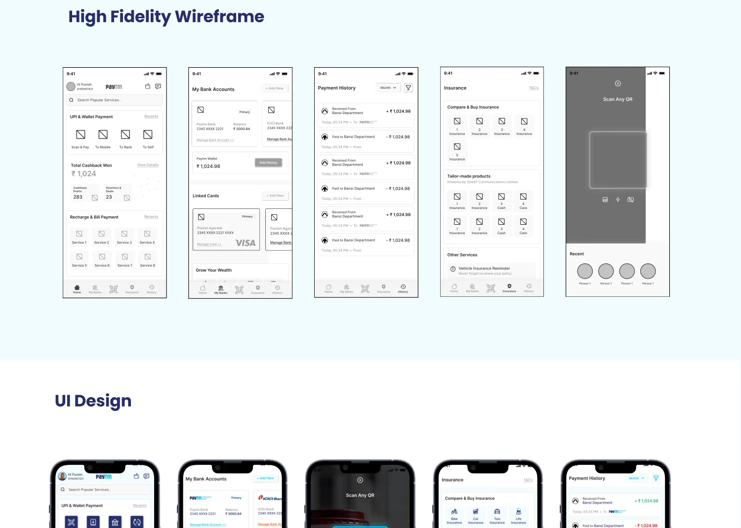
High fidelity, across the catalogue
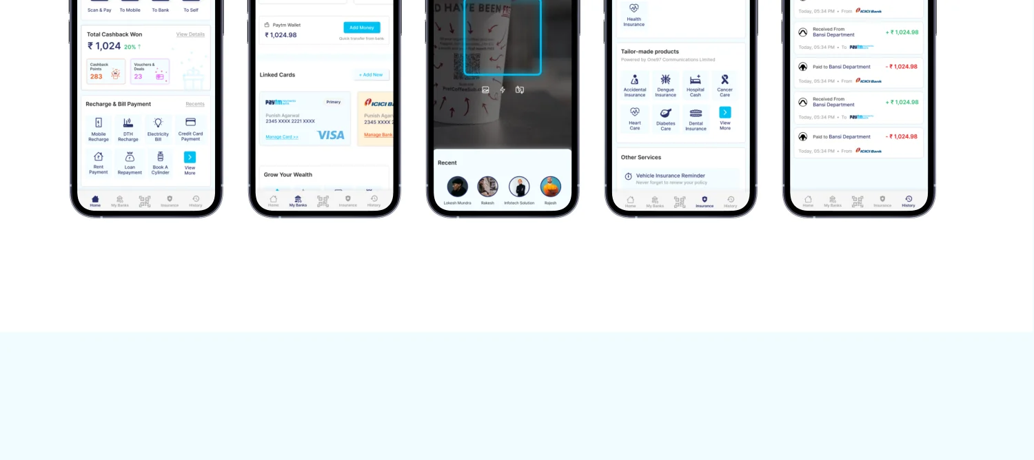
Every screen in the proposal laid out together, so the hierarchy could be checked across the whole product rather than one screen at a time.
The finished screens
Home, payments, accounts, scan and the service surfaces — one visual language holding a product that spans retail payments, banking and investments.
Conclusion
A home screen ordered by use, three core flows finishable in a single screen, and a long tail that stays reachable without crowding the front door.
The useful finding for client work: on a product this broad, nearly every design argument is really an argument about priority, and ranking by observed usage is the only version of that argument anyone can win.
What it added up to.
Got something that needs building properly?
Fifteen minutes is usually enough for us to tell you something useful about it.