
Travel Travel booking
The long form, made survivable
Travel booking forms ask for more information than almost any other consumer flow, and lose people at every field. This is a study in how to ask for all of it anyway.
- Client
- Self-initiated study
- Sector
- Travel
- Scope
- Research, form UX, interaction design
- Surface
- Responsive web
The challenge
A travel booking form has to collect traveller identity, passport details, dates, accommodation preferences, activities, dietary needs and emergency contacts. Presented as one wall of inputs it reads as work, and people abandon it — usually after they have already given you most of what you asked for.
This is a self-initiated study in how to ask for all of it anyway.
What we did
We benchmarked the major booking platforms, online and offline, to find which conventions travellers already carry with them — then wrote the trade-offs down for every repeated decision rather than picking by taste.
Business goals and user goals were documented side by side, because the business wants more data and the user wants fewer fields, and every question has to earn its place against that tension.
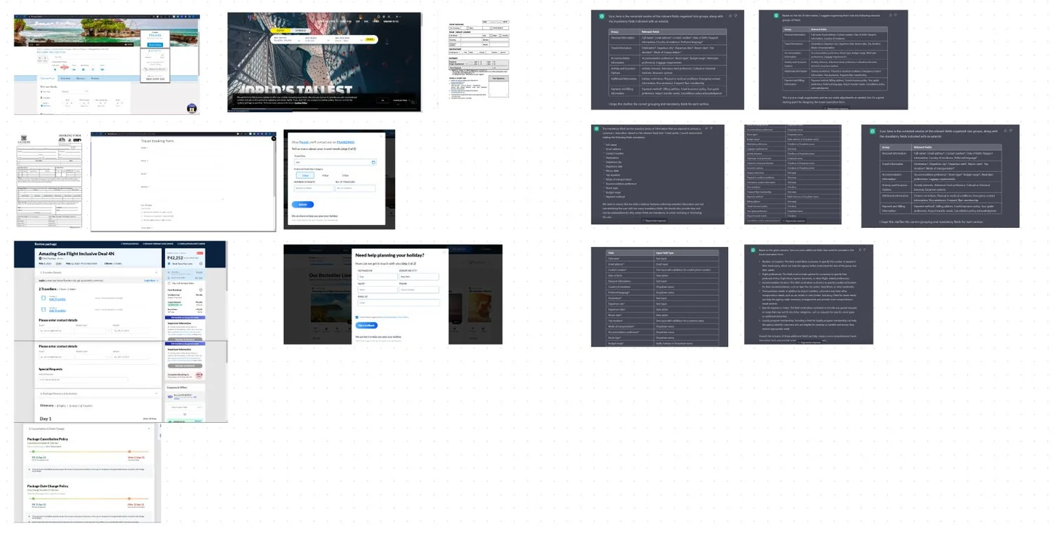
How everyone else asks
The major booking platforms, compared on the same questions. Three findings shaped everything after: information needs grouping, accounts exist so a part-filled form can be saved, and the form has to be reviewable rather than merely submittable.
Two goal sets, written side by side
The business wants more data and the user wants fewer fields. Every question on the form had to earn its place against both lists.
Business goals
An efficient process. Contact information captured. Maximised form filling and fewer abandonments. Less ambiguity in what is being asked. Smooth checkout. Well-segregated information. Higher customer satisfaction, and responsiveness.
User goals
An easy booking experience. Preferences and expectations met. Customisable features. A secure process. Confirmation and updates after submitting — and expectations set before starting.
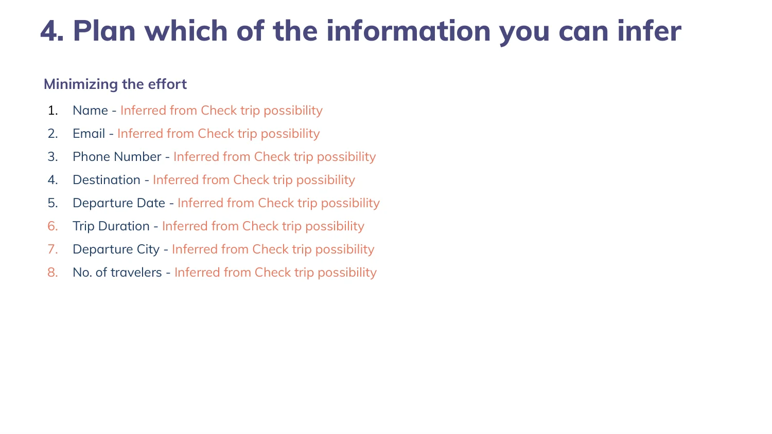
The best field is the one you never ask
Destination, phone number, departure city, trip duration and traveller count can all be inferred from the trip-possibility check the user has already completed. Minimising effort starts by deleting questions, not by styling them.
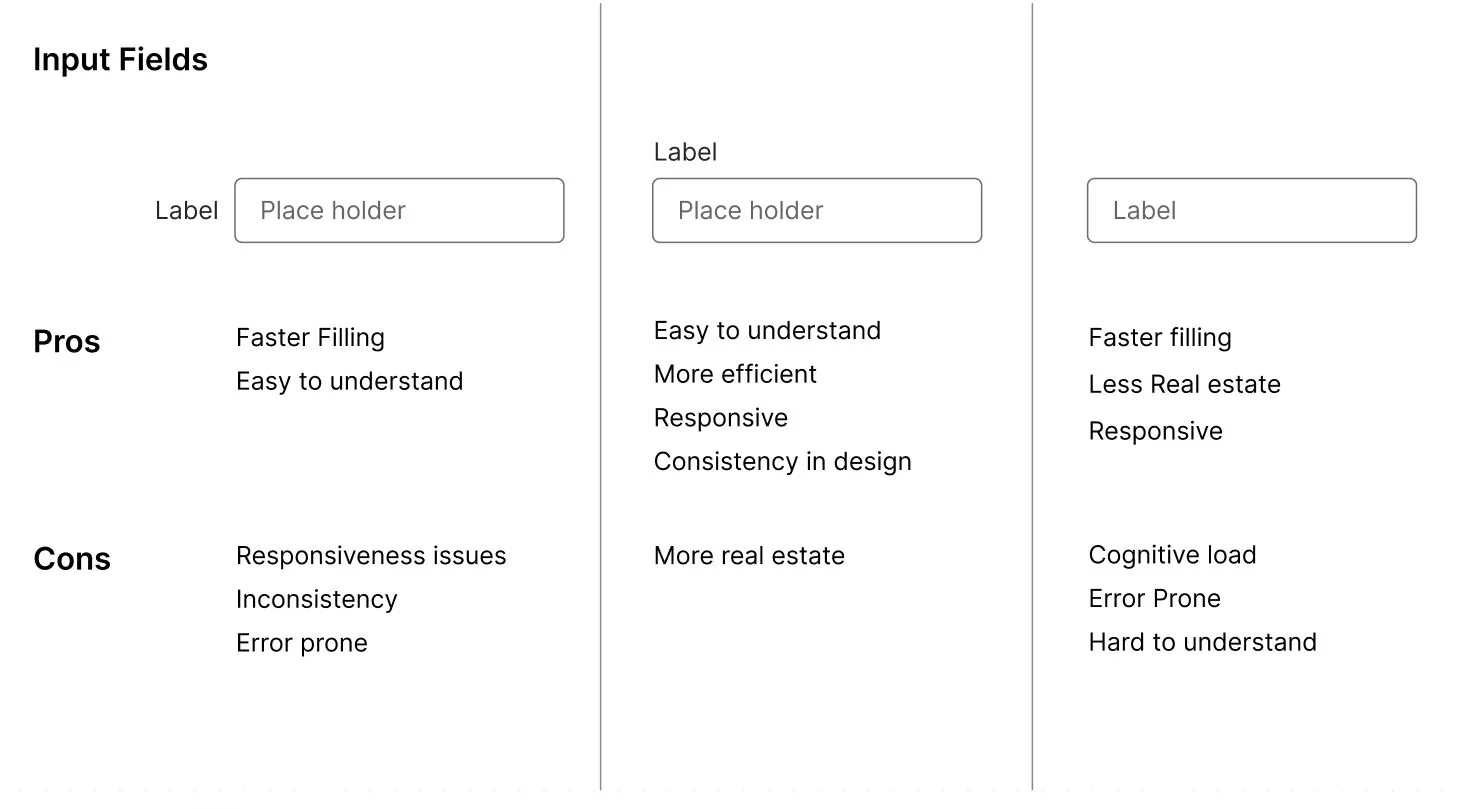
Where the label goes
Inside the field is compact but vanishes the moment someone types. Above is faster to scan but eats vertical space. Floating splits the difference and adds build complexity. On a form this long the decision repeats forty times, so we costed it.
Dates are the hardest field
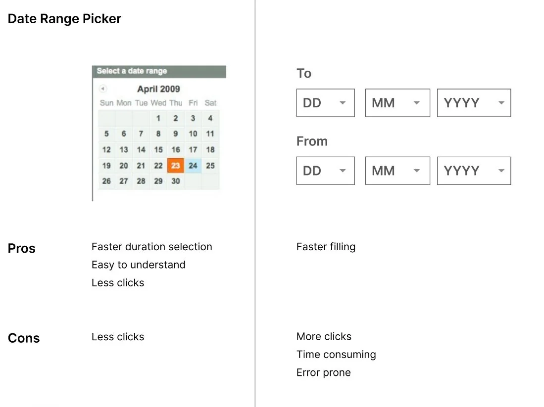
A calendar is faster for a duration and easier to understand but costs space and clicks. Typed dropdowns are quick for someone who knows the date and punishing for everyone else. Travel means choosing a range — so the calendar wins, and we said why.
Which element for which question
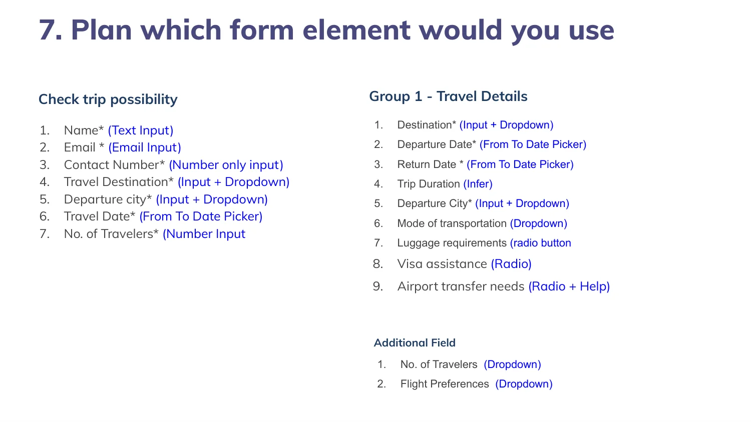
Text input, dropdown, date picker, radio, checkbox — assigned per field rather than by habit. Travel details alone need seven different controls, and getting one wrong adds a tap to every single booking.
One column or two
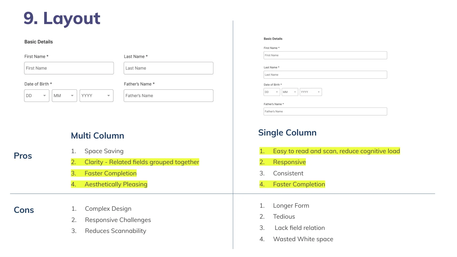
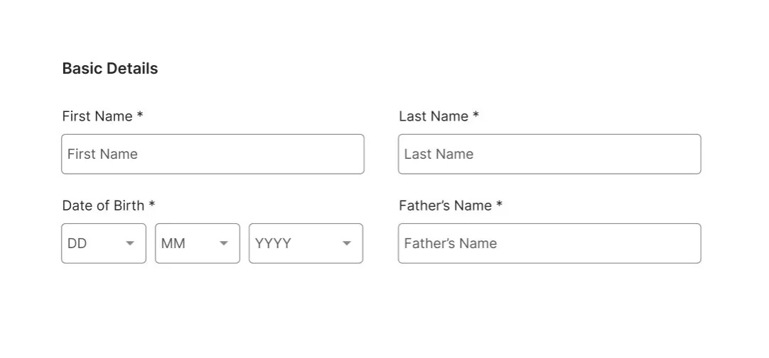
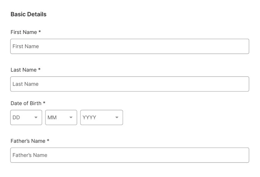
Two columns are denser and faster for short related pairs, at the cost of a complex layout and reduced scannability. One column is slower to scan but much harder to misread and survives a narrow screen. We used both — paired fields side by side, everything else stacked.
Single page or steps
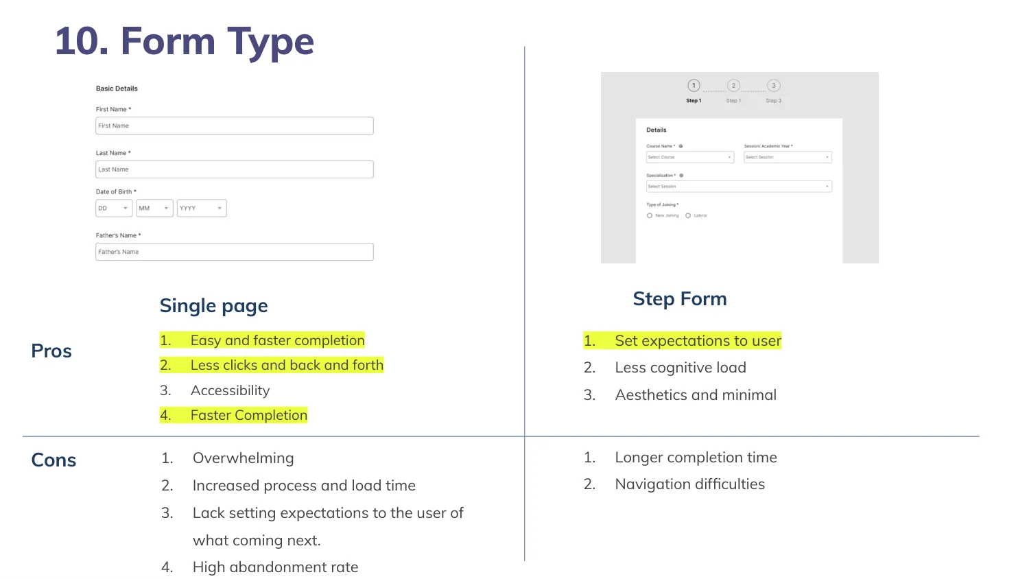
A single page is faster to complete and gives less cognitive load, but overwhelms and raises abandonment on a form this long. A step form sets expectations and aids completion, at the cost of time and navigation friction.
Telling people they are wrong
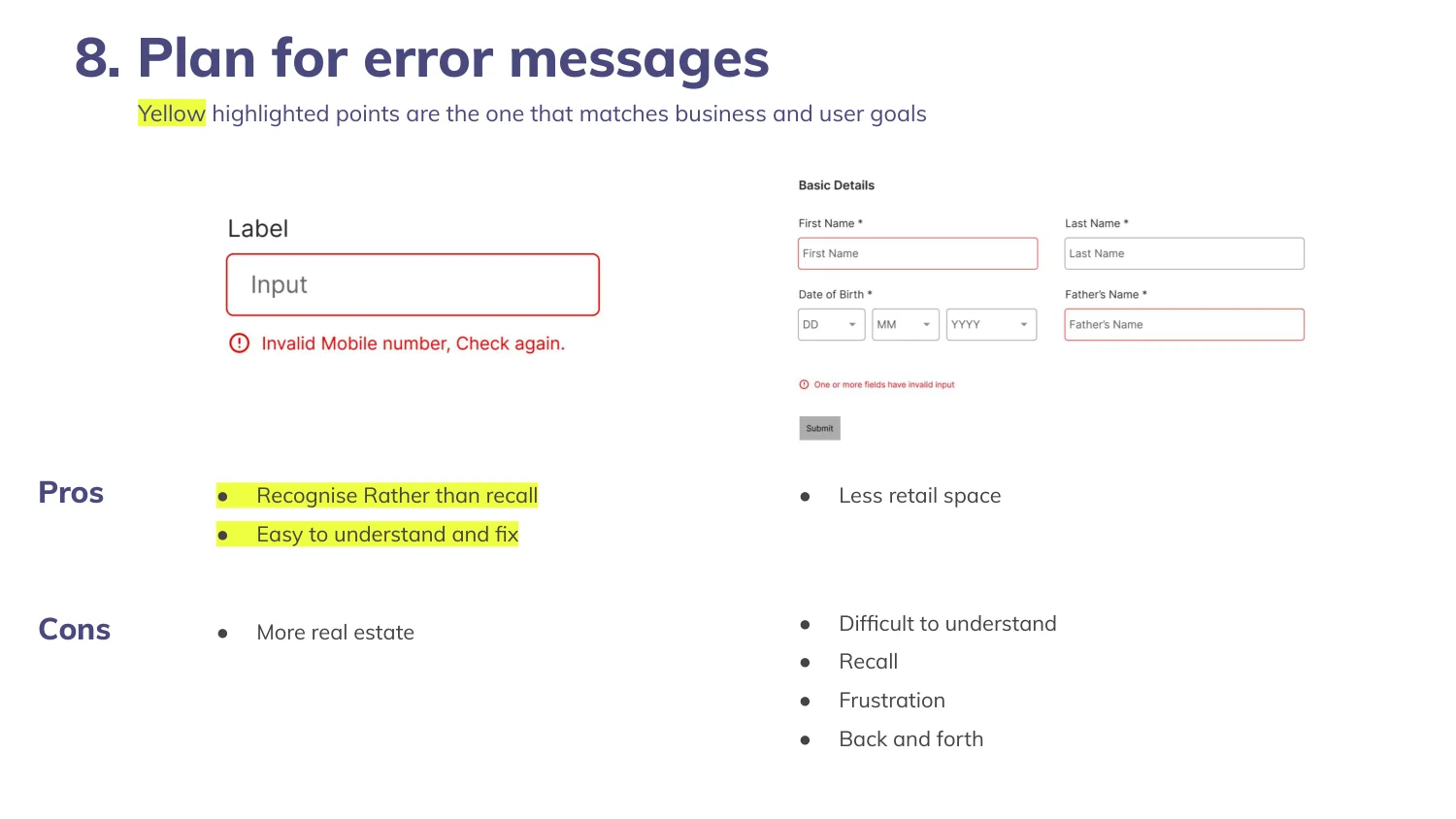
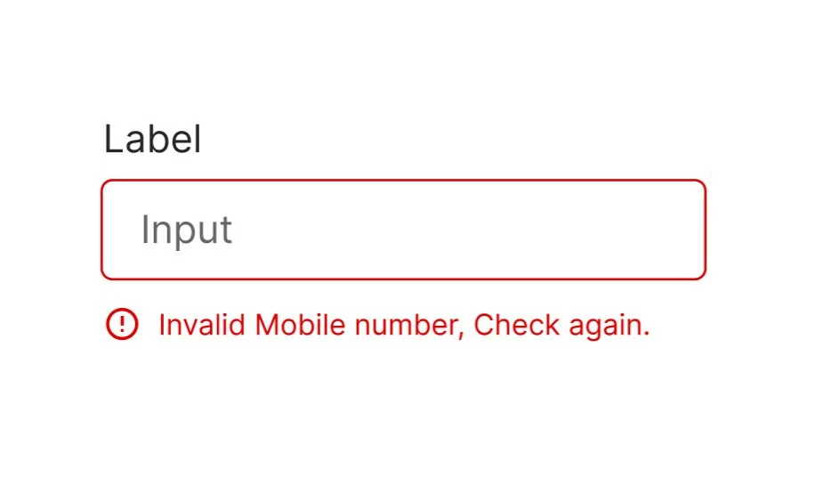
Error states get designed last and matter most, because they are the only part of a form that appears when someone is already frustrated. Say what is wrong, say it next to the field, and say it in words rather than in red alone.
The rule, applied
Inline, specific, and written out — so the second mistake is less alarming than the first.
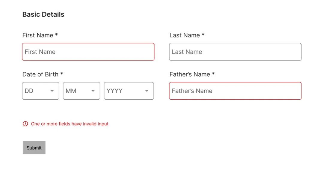
The same rule, across a section
Consistency in failure is what stops a long form feeling hostile — one error pattern, applied everywhere, so the second mistake is less alarming than the first.
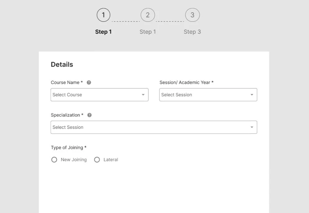
Three steps, position always visible
The form reorganised into logical groups — travel information, personal details, accommodation and food, activities, additional information — with mandatory fields marked honestly and optional ones visibly optional.
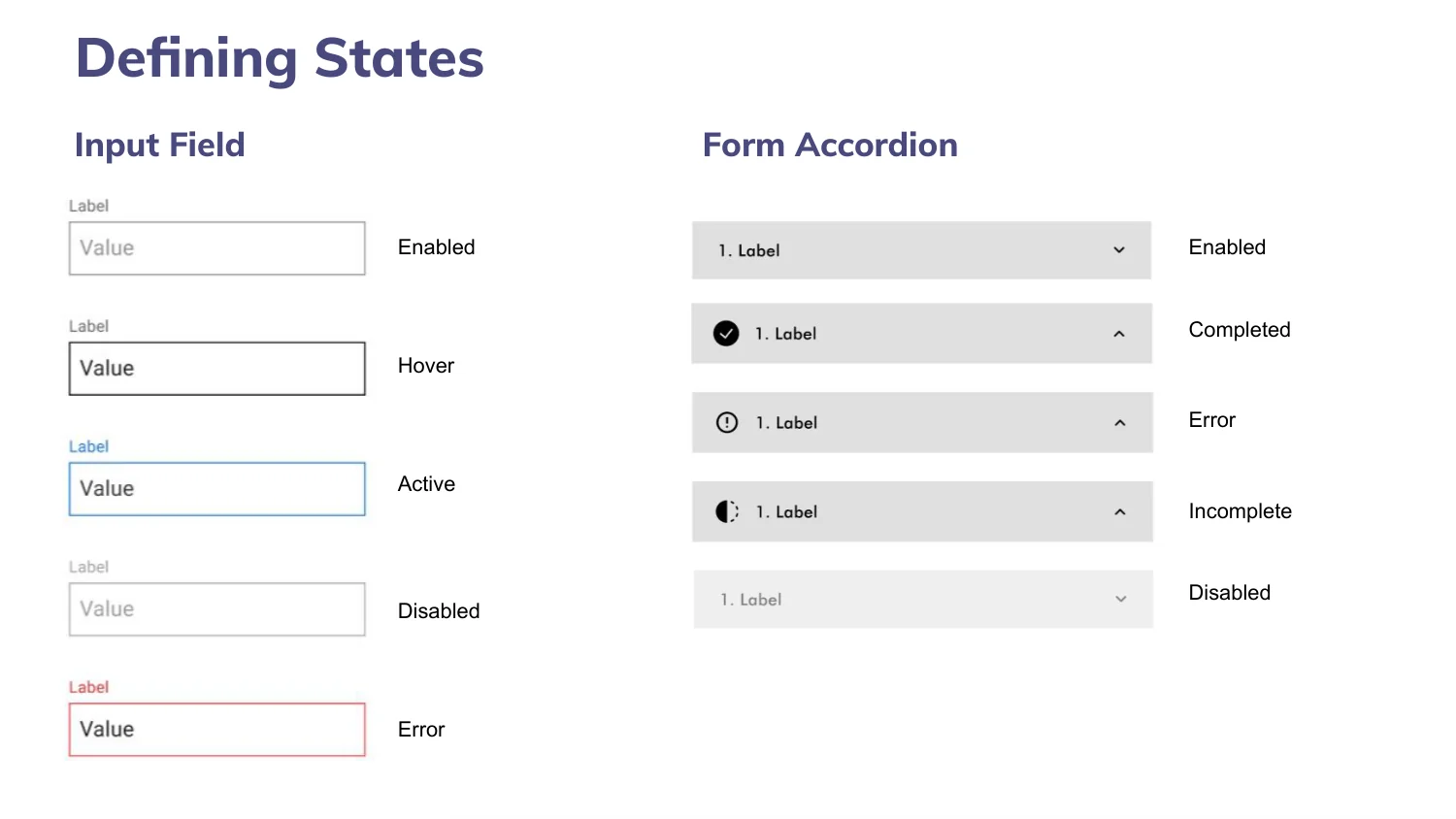
Every state, specified
Input fields across enabled, hover, active, disabled and error; accordion sections across enabled, completed, error, incomplete and disabled. Specifying these is what stops a build team inventing them one at a time.
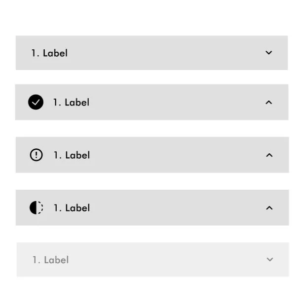
Section states in place
Complete, active, error and locked, each legible at a glance — so someone returning to a part-filled form knows where they stopped without reading anything.
What the comparisons settled
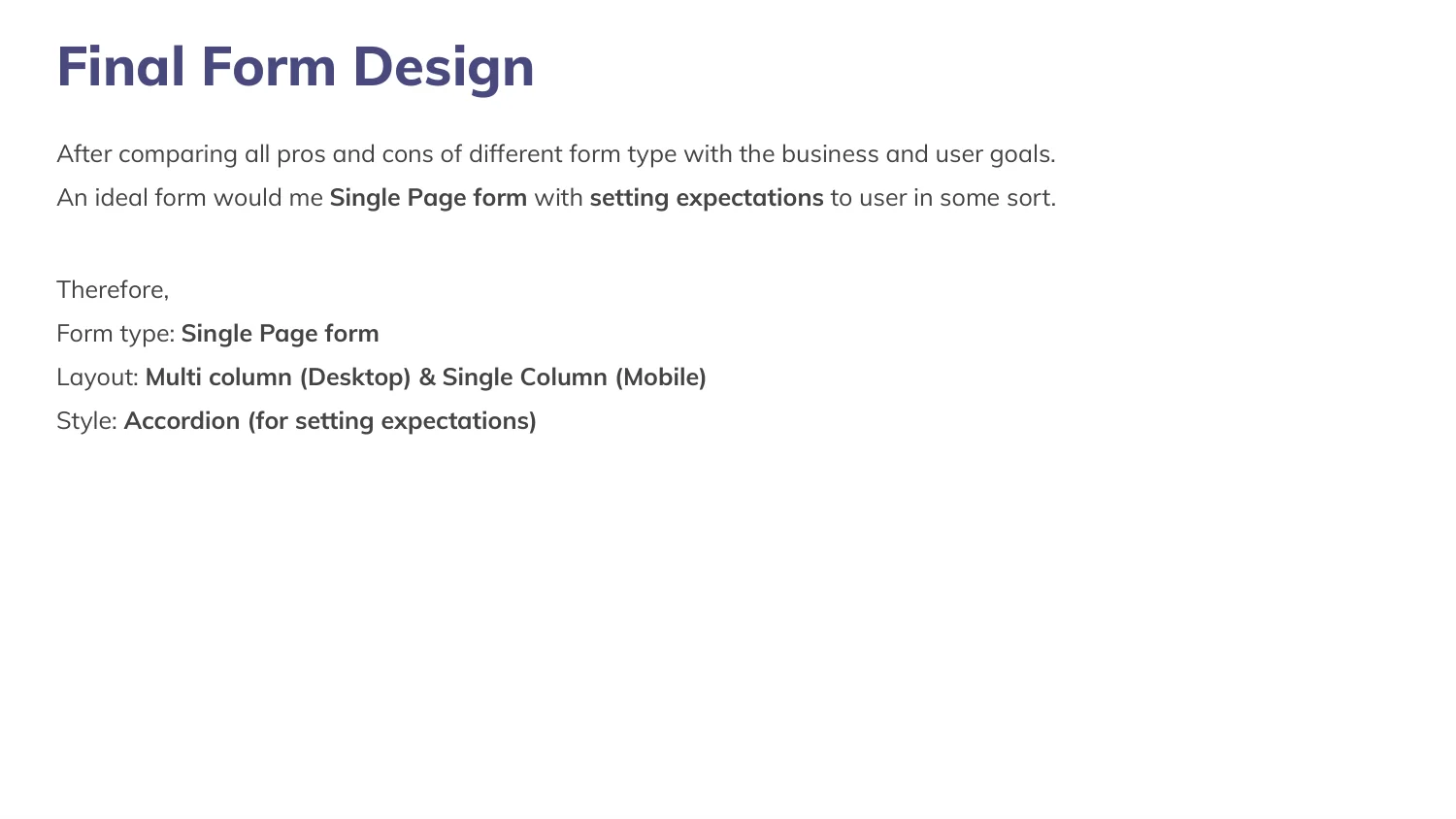
A single-page form, multi-column on desktop and single-column on mobile, with accordion sections setting expectations. Each of those is a line in a pros-and-cons table rather than a preference.
Conclusion
A long form made survivable: grouped into five logical steps, with a documented rationale behind every repeated decision — label placement, date entry, column count, error handling.
The transferable part is the method. On any form worth arguing about, writing the pros and cons down turns forty small aesthetic debates into four decisions you only have to make once.
What it added up to.
Got something that needs building properly?
Fifteen minutes is usually enough for us to tell you something useful about it.